Laurel Wreath
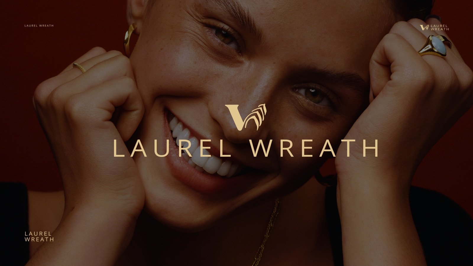
A freelance brand identity for Laurel Wreath, a house sourcing timepieces and creating custom fine jewellery. The brief: build a system that speaks directly to a high-end fashion customer in England — confident, warm, and unmistakably fine, without tipping into cold luxury cliché.
Logo & identity
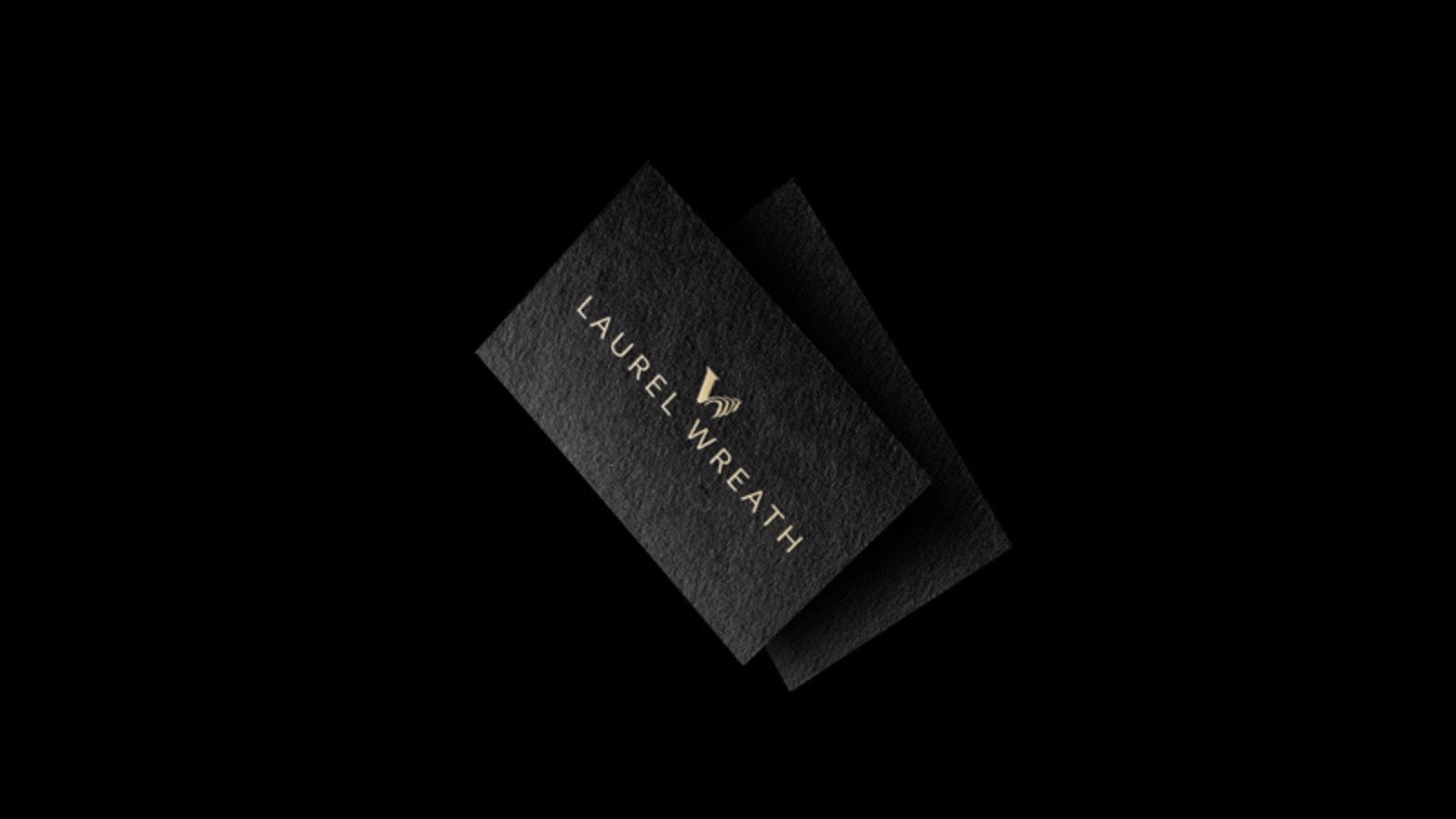
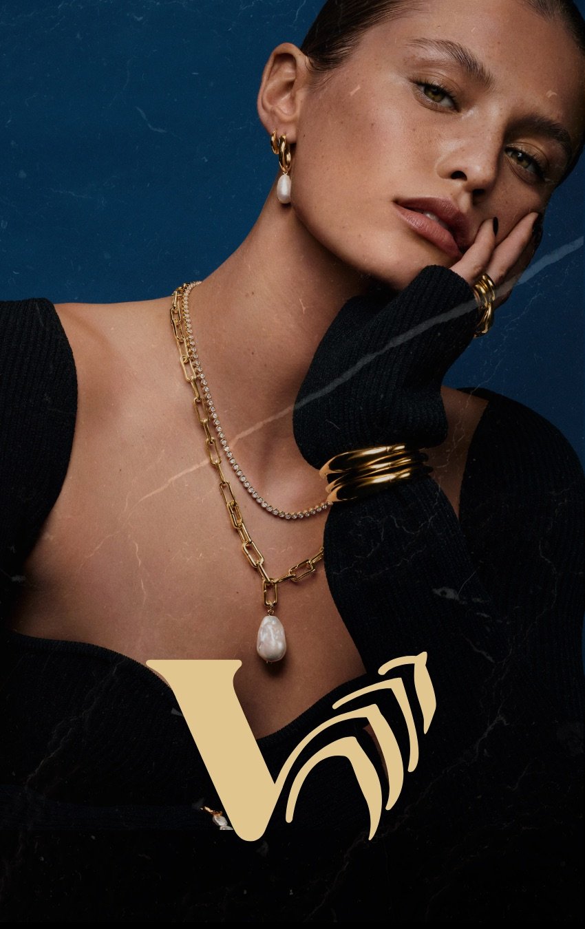
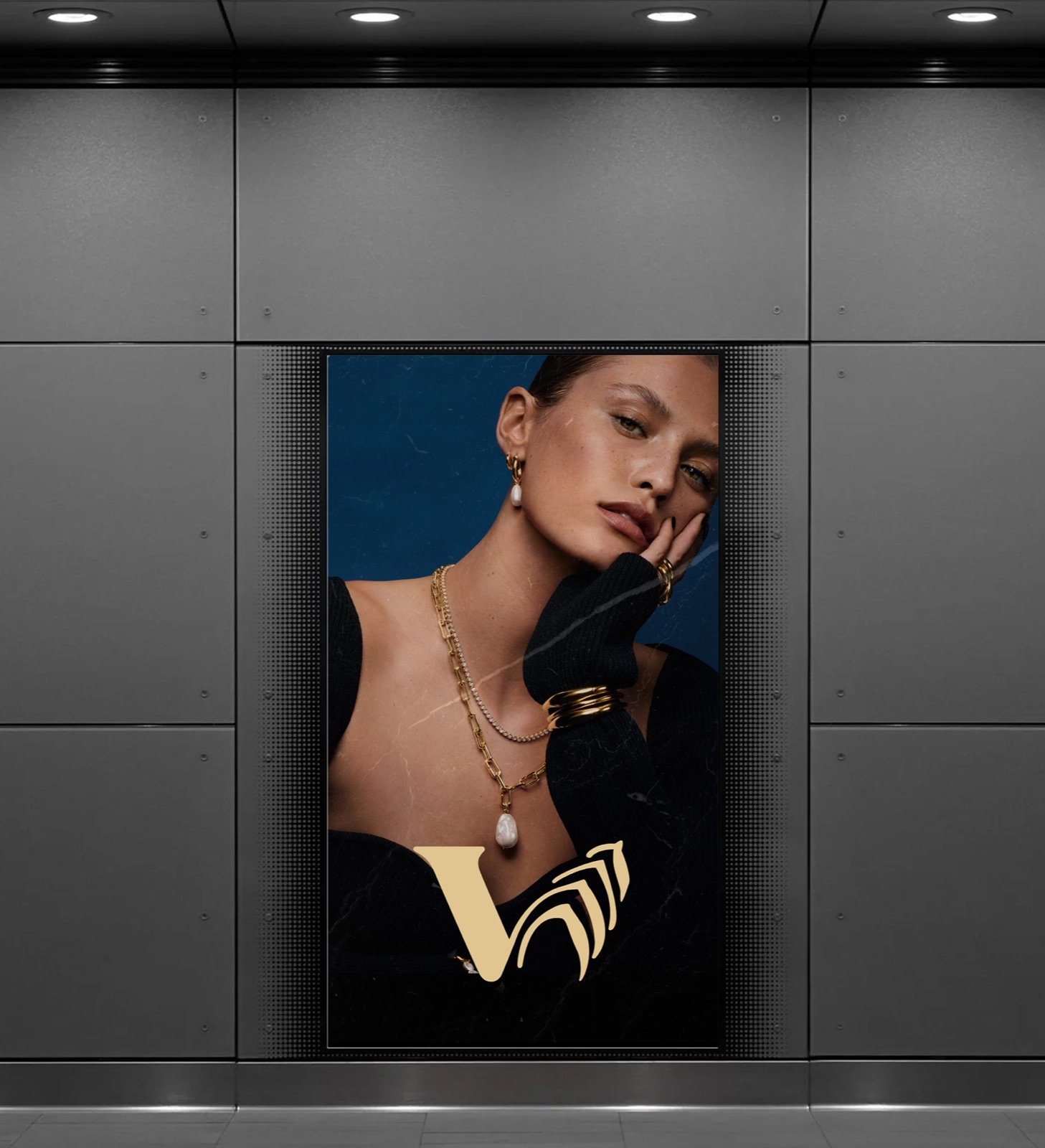
The mark folds a "V" into a laurel wreath — a nod to the brand name and to the idea of jewellery as something earned, not just bought. It sits in gold above a wide-tracked serif wordmark, giving the system a single, recognisable silhouette that scales from a business card to a subway billboard.
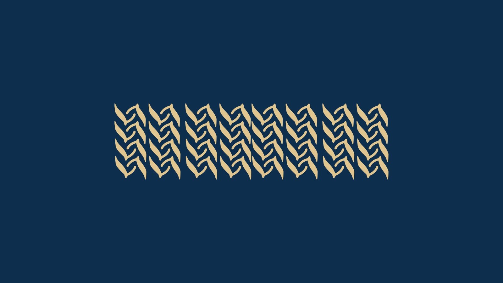
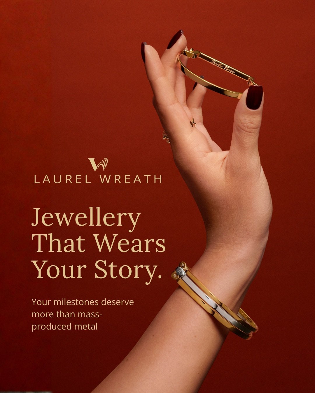
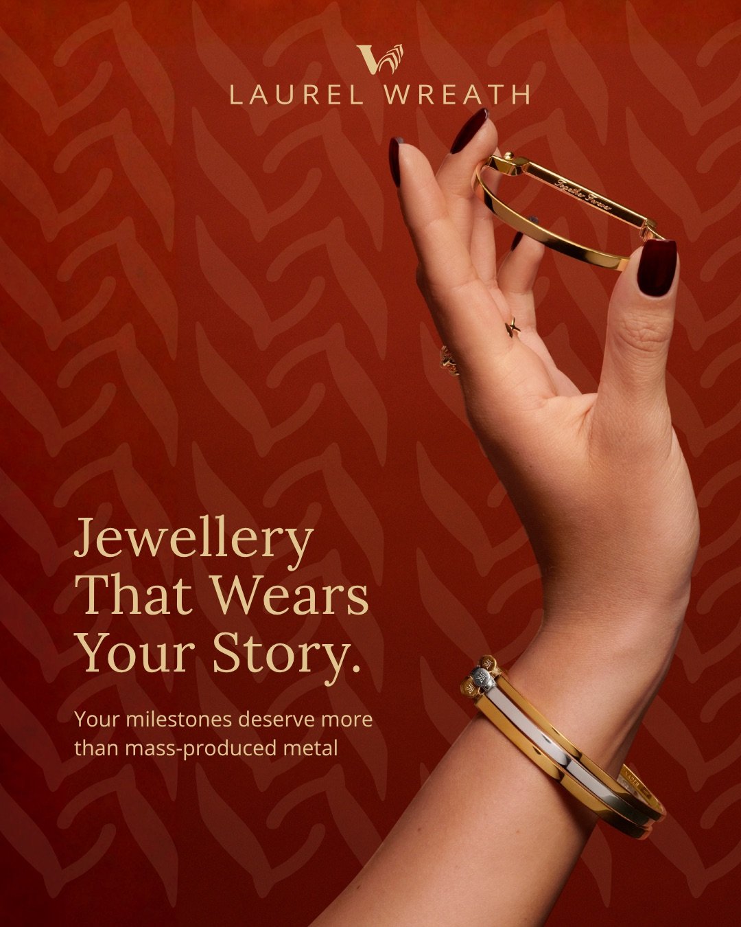
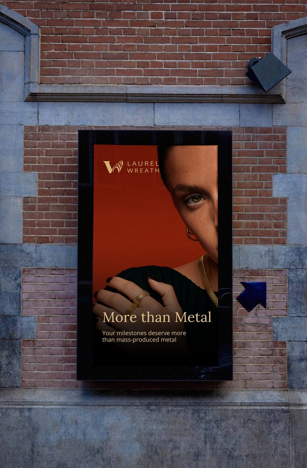
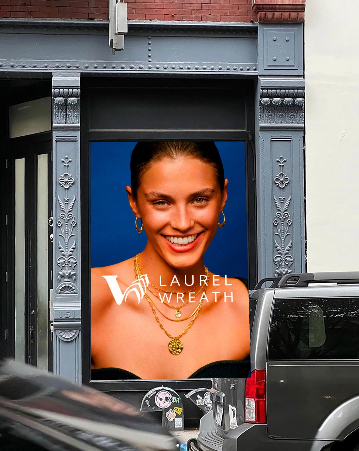
Two colourways carry the brand: a deep burgundy for warmth and intimacy, and a rich navy for a cooler, more editorial register. Gold foil and gold type tie both together, and a woven laurel-leaf pattern — pulled directly from the mark — gives the system a textile-like texture to fall back on across packaging and backgrounds.
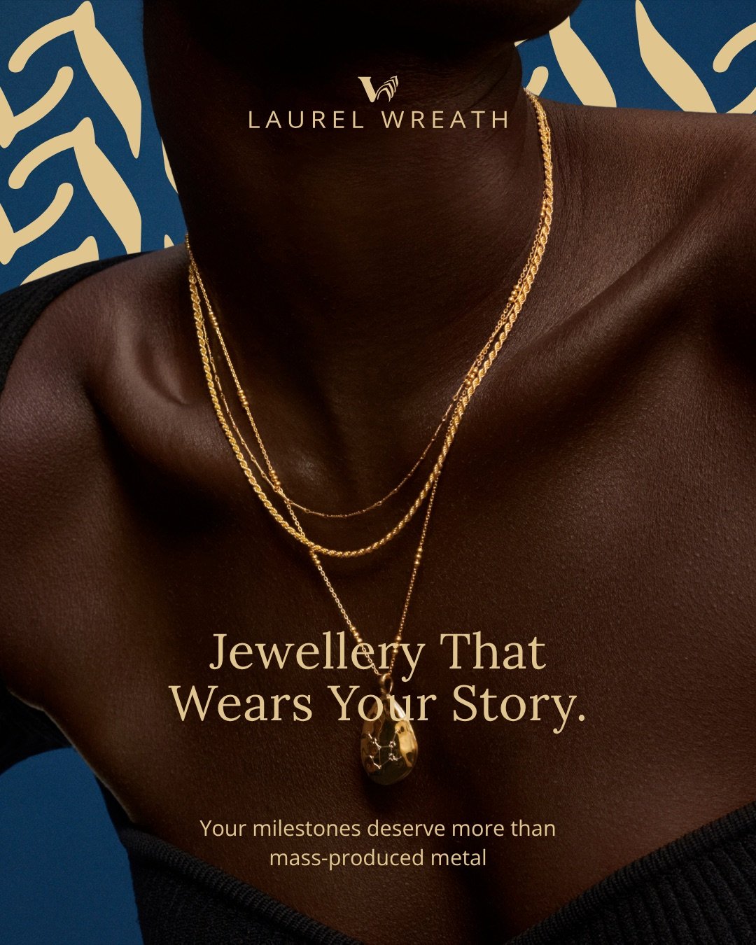
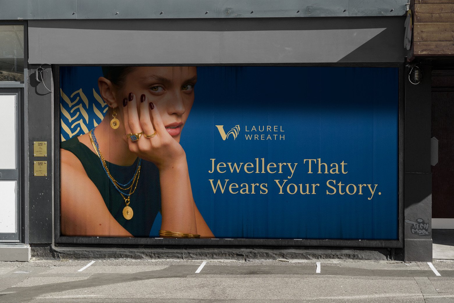
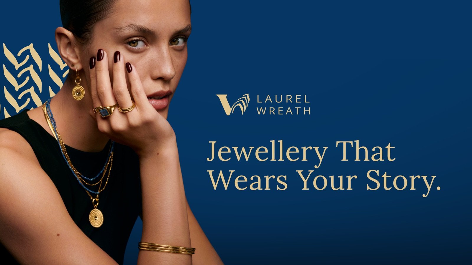
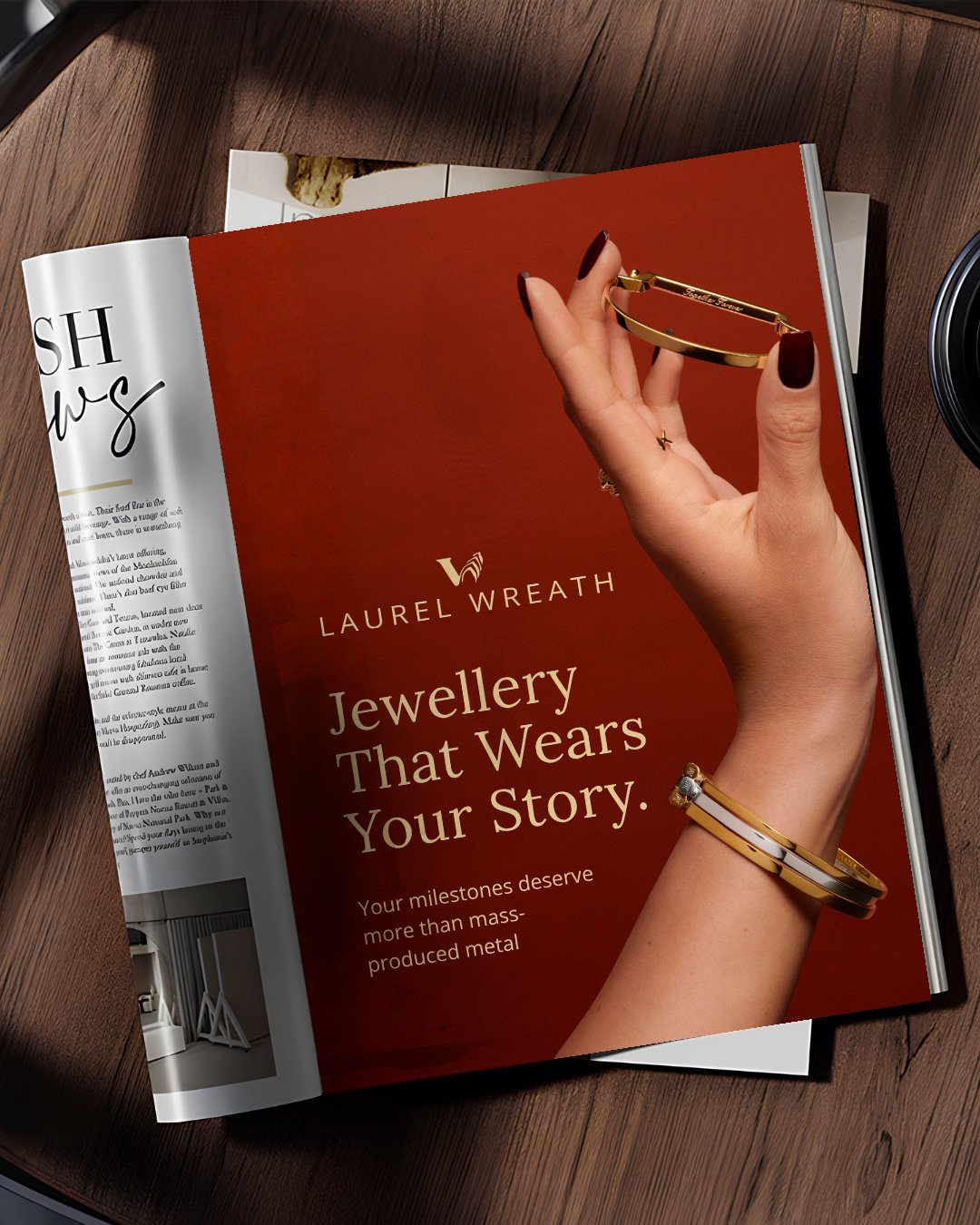
Campaign — "Jewellery That Wears Your Story."
The campaign line does double duty: it's a positioning statement ("your milestones deserve more than mass-produced metal") and a piece of copy warm enough to sit next to a portrait. It runs consistently across both colourways so the line, not just the imagery, becomes the thing people remember.
Packaging
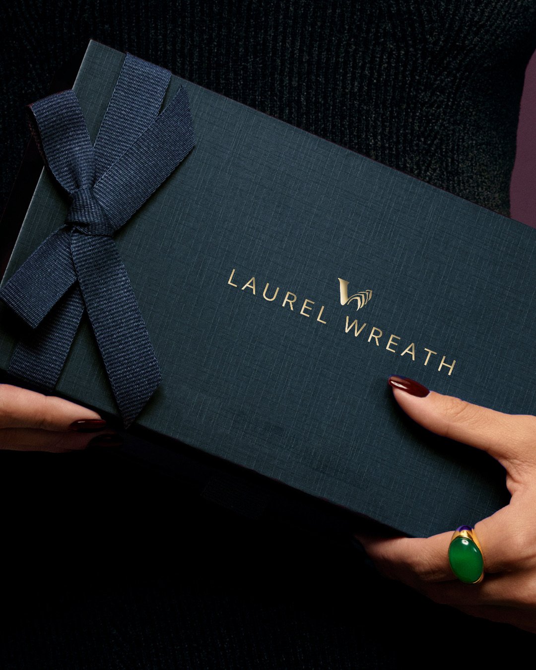
Deep teal linen with a grosgrain ribbon and gold foil stamp — packaging built to be unwrapped slowly, the same restraint as the rest of the system.
Out of home & print
From storefront takeovers to subway digital screens to a magazine spread, the identity was built to hold its own at billboard scale as easily as it does on a ring box.
Motion
The logo exploration, animated — showing how the wreath mark resolves from rough shape to the final wordmark lockup.