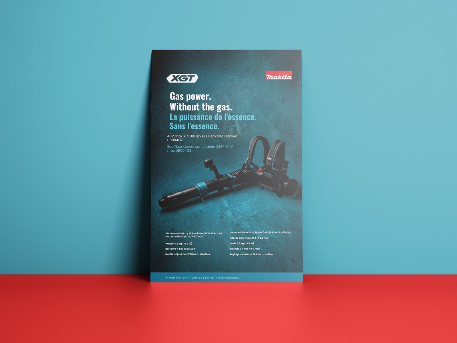
Makita — dealer campaign system
A self-directed concept: one product story, built across three formats for a power tool dealer channel. Not commissioned by Makita, and not affiliated with or endorsed by them.
Dealer marketing isn't brand advertising. The reader is a contractor standing at a counter, deciding between this tool and the one beside it. The material's job is to make the argument legible in about four seconds.
The category
Most speculative tool work makes the mistake of designing an ad. Power tool dealer material isn't advertising — it's sales enablement. It lives on a counter, in a dealer's hand, or clipped to a shelf rail beside four competing brands.
That changes everything about the hierarchy. Specs aren't small print, they're the argument. Colour does the identifying before a word is read — Milwaukee is red, DeWalt is yellow, Makita is the only teal on the shelf. And there has to be room for someone else's logo and someone else's price, because the sheet finishes its life in a store you don't control.
The story
The subject is a 40V max cordless backpack blower. Blowers have always been gas: fuel to mix, fumes to breathe, an engine to service, noise that limits when you can work.
The manufacturer's own published claim is that this one delivers blowing force comparable to a 65cc gas backpack blower. That's the entire argument, already substantiated — so the line wrote itself.
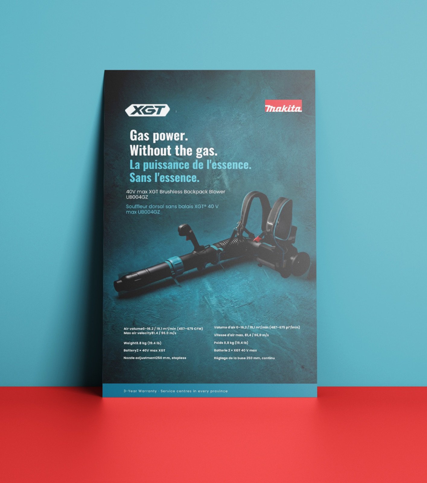
Gas power.
Without the gas.
I didn't invent a benefit. The work's job was to make an existing, defensible claim impossible to miss.
One idea, three formats
The three pieces don't share a layout. They share an argument, re-solved for what each format actually does.
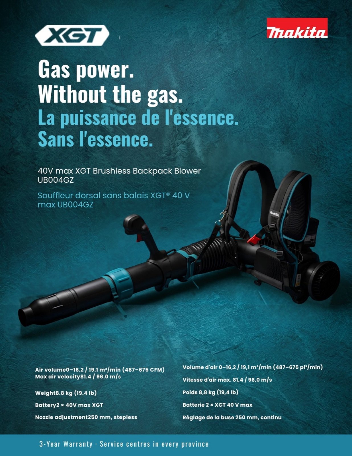
Dealer flyer
The comparison tool. Full spec table, because this is the sheet a contractor takes away and measures against a competitor.
Shelf card
The buyer is already standing in front of the tool. Three specs, the model number large enough to ask for, and the 65cc claim promoted to near-hero. Everything else cut.
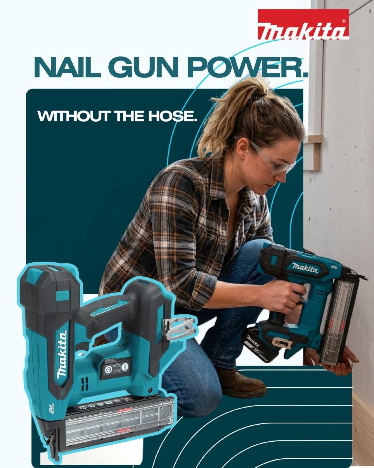
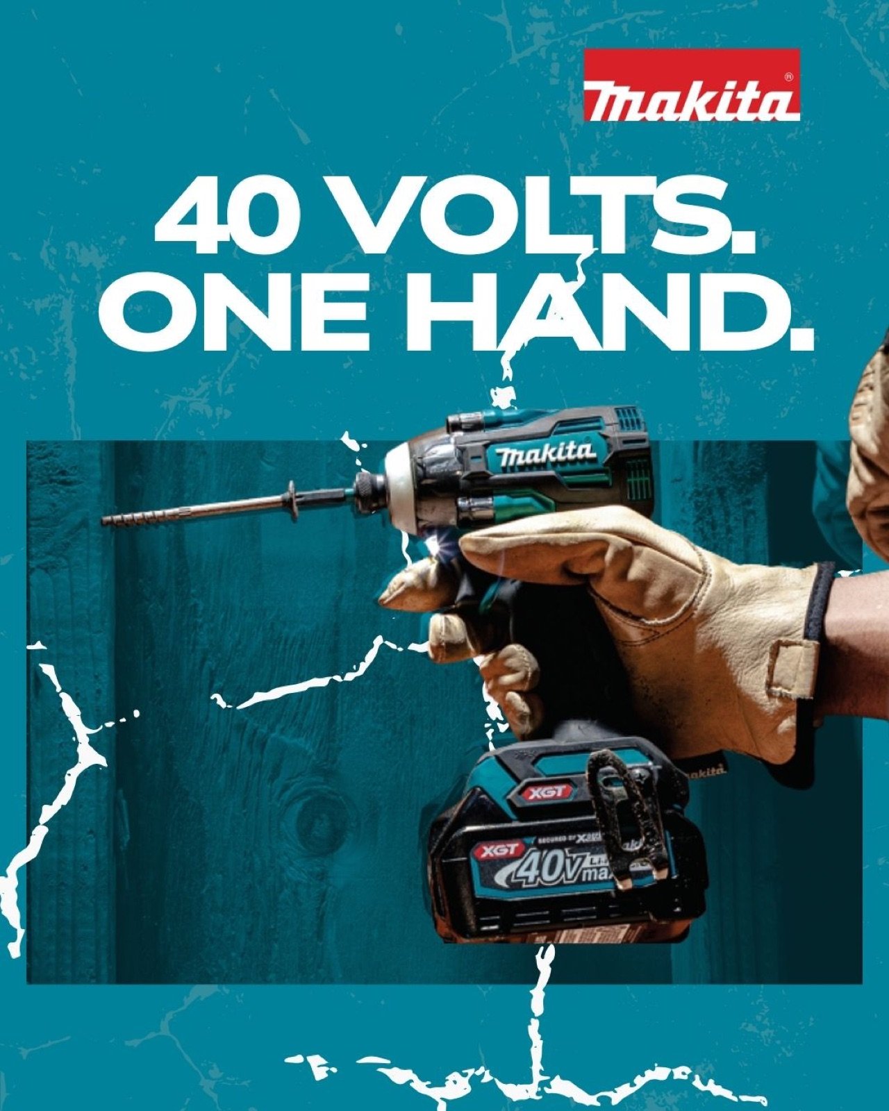
Social
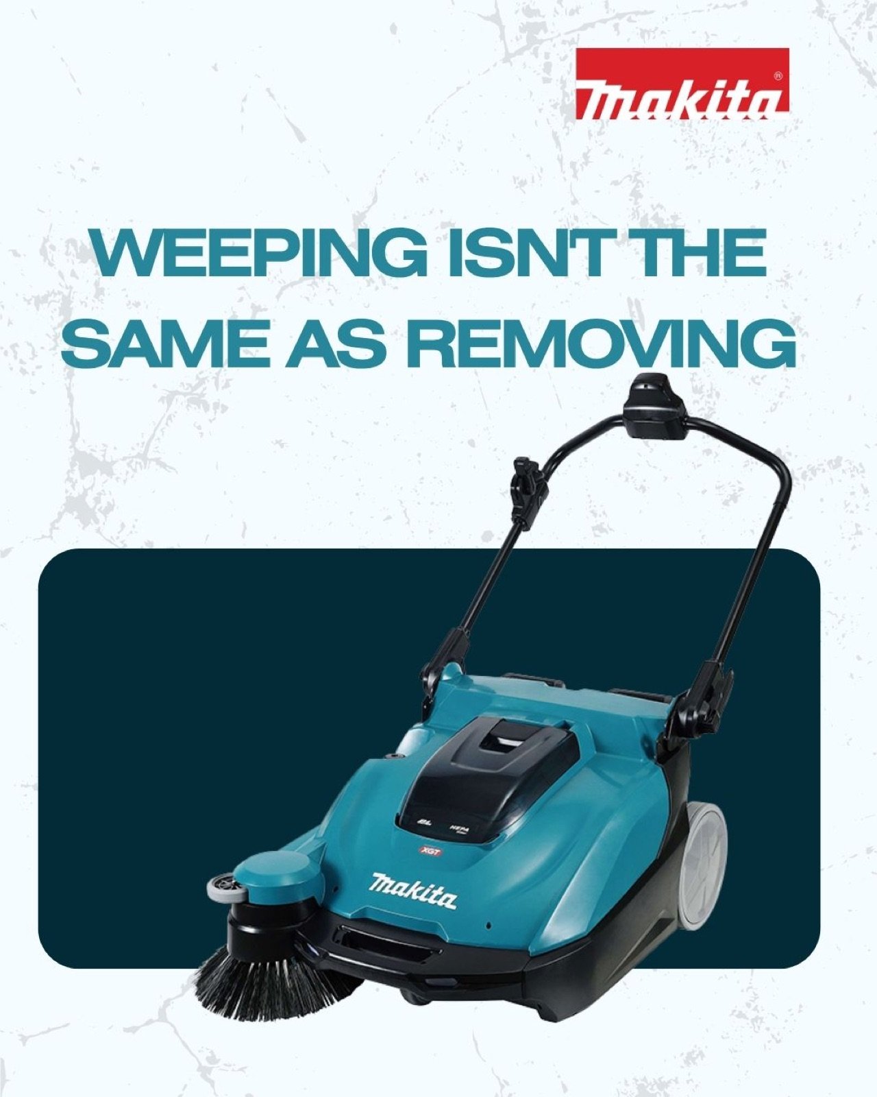
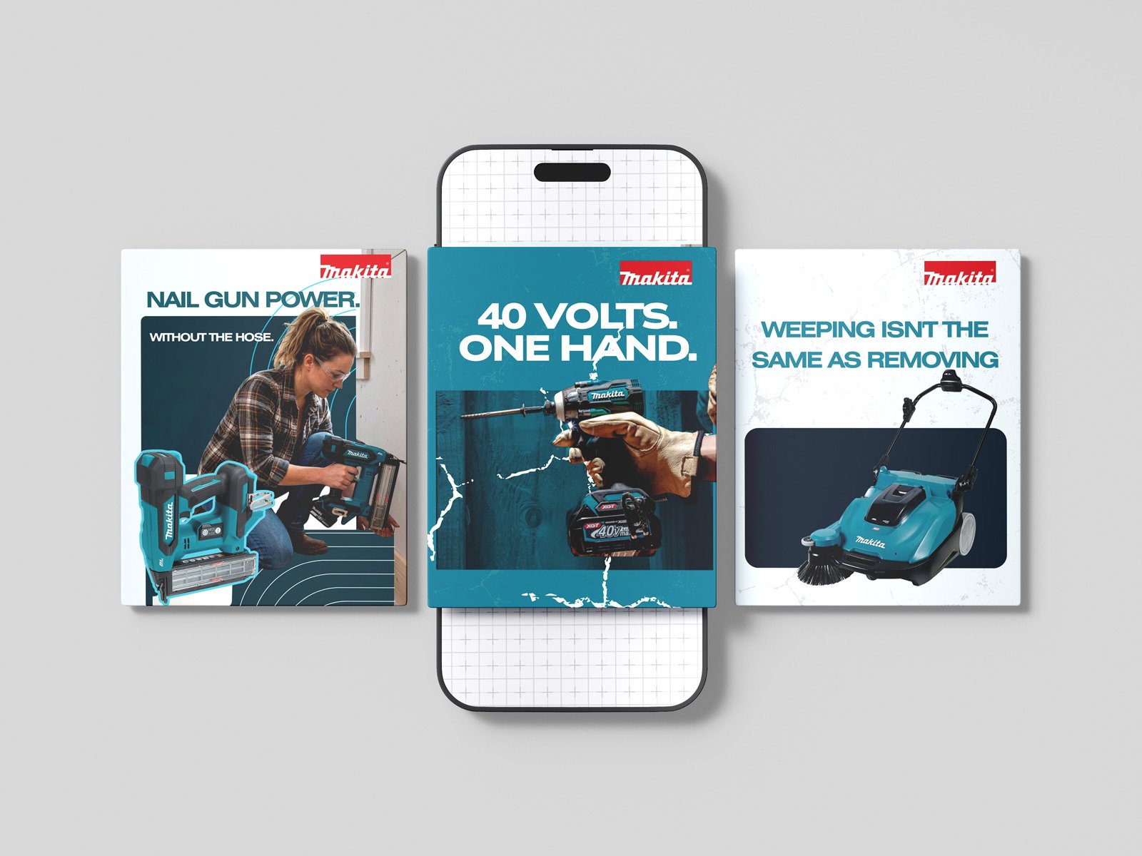
One idea per post, specs moved into the caption, sized for a thumb. This is where the individual features get room to breathe rather than competing on a single page.
Scaling a layout down doesn't work — a composition built for a full page dies at 320 pixels. So the first decision was the minimum viable expression: what has to survive at the smallest size for the idea to still read. Here that's the product, the two-line headline, and the claim. Everything else was added back as space allowed.
Social
One idea per post — each feature given its own frame rather than competing for space on a single sheet.
Click to open
Designed bilingual
Canadian dealer material frequently runs in English and French, and French sets roughly 40% longer than English. A headline box that fits one and breaks the other isn't finished work.
Both language versions run on the same grid at the same type size — the layout was built for the longer language first. Decimal commas, unit spacing and French punctuation are set to Canadian convention, because those are the details a bilingual reader notices immediately.
Self-directed concept project. Not commissioned by, affiliated with, or endorsed by Makita. Product photography and specifications are the manufacturer's own, used here for a non-commercial design exercise. Makita, XGT and LXT are trademarks of Makita Corporation.